
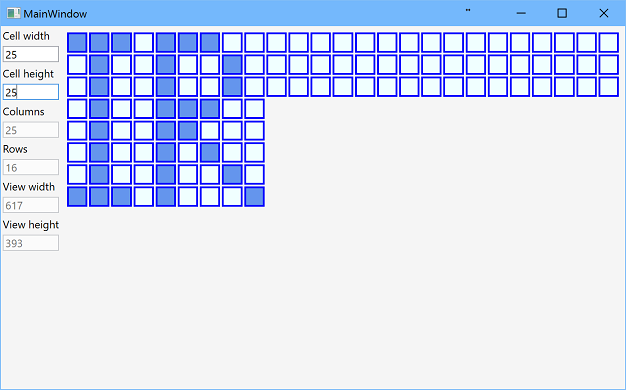
Grid with dynamic number of rows and columns
The post showcases a WPF datagrid with dynamic columns where the number of rows and columns is defined but all cells have the same size.
Table of contents:
Source code
Download application - 43.4 KB
Download source - 26.5 KB
GitHub
Introduction
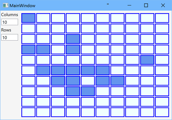
The post is devoted to the WPF gridview with a dynamically-defined number of rows and columns but all cells have the same width and height. For example, such a grid could be used in chess or checkers games for 8x8 field.
Application has the following features:
- WPF grid has multiple rows and columns;
- number of rows and columns can be changed at run-time;
- all cells has the same width and the same height;
- grid occupies as much space as possible;
- input click switches the state of the cell.
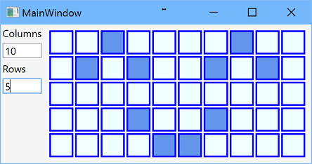
You can look at the WPF grid example in the image below, which shows a 10x5 grid table. The values for the number of rows and columns may change dynamically.
Let’s take a look at how WPF creates a grid programmatically.
Background
Solution uses C#6, .Net 4.6.1, Wpf with MVVM pattern.
Solution
Wpf application
Wpf application is done in MVVM pattern with one main window. Dynamic grid is implemented as user control that contains DataGrid control bound to observable collection of collections of cell view models. In this implementation collection of cells is recreated each time if grid width or grid height is changed, and it leads to some application pauses. In the following post this issue is solved with asynchronous method that updates cell array. Also, other implementation for cells could be used; for example, 2-dimensional array of cells ICellViewModels[][] works well.
Behind code
Dynamic grid view model implements IDynamicGridViewModel interface that has two size’s properties for grid width and height that are number of rows and columns, observable collection of collections of cell view models, and several color properties:
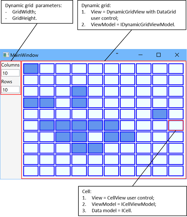
The Datagrid column definition in WPF and its corresponding row definition are represented by two parameters - GridWidth and GridHeight.
public interface IDynamicGridViewModel
{
  /// <summary>
  /// 2-dimensional collections for CellViewModels.
  /// </summary>
  ObservableCollection<ObservableCollection<ICellViewModel>>
    Cells { get; }

  /// <summary>
  /// Number of grid columns.
  /// </summary>
  int GridWidth { get; }

  /// <summary>
  /// Number of grid rows.
  /// </summary>
  int GridHeight { get; }

  /// <summary>
  /// Start, the lightest, color of cells.
  /// </summary>s
  Color StartColor { get; set; }

  /// <summary>
  /// Finish, the darkest, color of cells.
  /// </summary>
  Color FinishColor { get; set; }

  /// <summary>
  /// Color of borders around cells.
  /// </summary>
  Color BorderColor { get; set; }
}
Values of color properties are assigned to corresponding properties of CellView control. View model for each cell implements ICellViewModel interface that defines property for data model that implements ICell interface and command for changing state for the cell.
public interface ICellViewModel
{
  ICell Cell { get; set; }
  ICommand ChangeCellStateCommand { get; }
}
And, finally, ICell interface contains one Boolean property State:
public interface ICell
{
  /// <summary>
  /// State of the cell.
  /// </summary>
  bool State { get; set; }
}
XAML
The same height of cells is controlled by RowHeight property defined in style of DataGrid:
<Style TargetType="{x:Type DataGrid}">
  <Setter Property="RowHeight">
    <Setter.Value>
      <MultiBinding Converter="{StaticResource DivideDoubleConverter}"
                    ConverterParameter="2">
        <Binding RelativeSource="{RelativeSource Self}"
                 Path="ActualHeight" Mode="OneWay"
                 Converter="{StaticResource SubstractConverter}"
                 ConverterParameter="2"/>
        <Binding Path="DataContext.GridHeight"
                 RelativeSource="{RelativeSource Self}"
                 Mode="OneWay"/>
      </MultiBinding>
    </Setter.Value>
  </Setter>
</Style>
Here, WPF grid binding data is provided by “MultiBinding Converter” and “Binding RelativeSource.”
Cell height equals to actual height of data grid minus 2 divided by number of rows. The same width of cells is controlled by Width property of cell data template:
<DataTemplate x:Key="CellTemplate">
  <Border BorderBrush="Transparent"
      BorderThickness="1 0 1 0"
      DataContext="{Binding}">
    <Border.Width>
      <MultiBinding Converter="{StaticResource DivideDoubleConverter}" ConverterParameter="2">
        <Binding RelativeSource="{RelativeSource FindAncestor, AncestorType={x:Type DataGrid}}"
              Path="ActualWidth" Mode="OneWay"
              Converter="{StaticResource SubstractConverter}" ConverterParameter="2"/>
        <Binding RelativeSource="{RelativeSource FindAncestor, AncestorType={x:Type DataGrid}}"
              Path="DataContext.GridWidth" Mode="OneWay"/>
      </MultiBinding>
    </Border.Width>

    <views:CellView
      DataContext="{Binding}"
      BorderColor="{Binding DataContext.BorderColor,
              RelativeSource={RelativeSource FindAncestor, AncestorType={x:Type DataGrid}},
              Mode=OneWay, FallbackValue=#FF000000}"
      StartColor="{Binding DataContext.StartColor,
              RelativeSource={RelativeSource FindAncestor, AncestorType={x:Type DataGrid}},
              Mode=OneWay, FallbackValue=#FFF0F0F0}"
      FinishColor="{Binding DataContext.FinishColor,
              RelativeSource={RelativeSource FindAncestor, AncestorType={x:Type DataGrid}},
              Mode=OneWay, FallbackValue=#FF0F0F0F}"/>
  </Border>
</DataTemplate>
Similarly, cell width equals to actual width of data grid minus 2 divided by number of columns. And there is a definition of DataGrid control:
<datagrid datacontext="{Binding}" isenabled="True" istabstop="False" itemssource="{Binding Path=Cells}" x:name="DynamicGrid">
  <datagrid.columns>
    <datagridtemplatecolumn width="*">
      <datagridtemplatecolumn.celltemplate>
        <datatemplate>
          <itemscontrol itemssource="{Binding}" itemtemplate="{DynamicResource CellTemplate}">
            <itemscontrol.itemspanel>
              <itemspaneltemplate>
                <stackpanel orientation="Horizontal">
              </stackpanel></itemspaneltemplate>
            </itemscontrol.itemspanel>
          </itemscontrol>
        </datatemplate>
      </datagridtemplatecolumn.celltemplate>
    </datagridtemplatecolumn>
  </datagrid.columns>
</datagrid>
If you need WPF to populate datagrid, please refer to the following discussion on Microsoft’s Q&A blog.

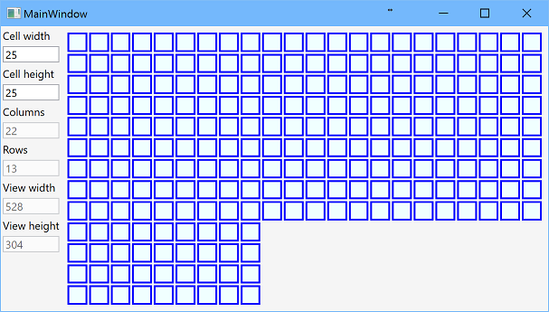
WPF Windows on Two Screens
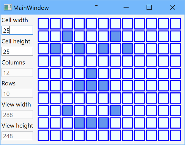
The post is devoted to the Wpf datagrid with cells that have defined fixed size but a number of rows and columns is updated dynamically in order to fill all available space. For example, such grid could be used in games at infinite 2D field or implementation of cellular automaton.
Source code
Features
Application demonstrates the following features:
- all cells has fixed width and height;
- size of cells could be changed at run-time;
- number of rows and columns are defined by user control size;
- grid occupies as much space as possible;
- input click switches the state of the cell;
- asynchronous method of adding/deleting cells;
- resize timer that prevents too frequent cell updating;
- preserve cell states;
- using of dependency container;
- logging.
Background
Solution uses C#6, .Net 4.6.1, Wpf with MVVM pattern, NuGet packages Unity and Ikc5.TypeLibrary.
Solution
Wpf application
Wpf application is done in MVVM pattern with one main window. Dynamic grid is implemented as user control that contains DataGrid control bound to observable collection of collections of cell view models.
View model of dynamic data grid contains cell, view and grid sizes, data model for cell set, and collection of collections of cell view models. View size properties are bound to actual size of data grid control. Actually, it is not a clear approach from the point of MVVM pattern, as view model should know nothing about view, but it is realized in accurate way via binding and attached properties. Grid size, i.e. number of rows and columns, is calculated as view size divided by cell size. As number of rows and columns are integers, real size of cells on the view could not equal to values of cell width and height.
After control size is changed and number of rows and columns of grid are calculated, cell set is recreated, but state of cells are preserved. Then collection of cell view models is updated by asynchronous method. Method analyses necessary changes and remove or add rows and remove or add cell view models to rows. Asynchronous method allows to keep application responsible, and using cancellation token allows to cancel updating if control size is changed again.
Dynamic grid control
Dynamic grid view model implements IDynamicGridViewModel interface that has size's properties, data model of cell set, observable collection of collections of cell view models, and several color properties:
public interface IDynamicGridViewModel
{
  /// <summary>
  /// Width of current view - expected to be bound to view's actual
  /// width in OneWay binding.
  /// </summary>
  int ViewWidth { get; set; }

  /// <summary>
  /// Height of current view - expected to be bound to view's actual
  /// height in OneWay binding.
  /// </summary>
  int ViewHeight { get; set; }

  /// <summary>
  /// Width of the cell.
  /// </summary>
  int CellWidth { get; set; }

  /// <summary>
  /// Height of the cell.
  /// </summary>
  int CellHeight { get; set; }

  /// <summary>
  /// Count of grid columns.
  /// </summary>
  int GridWidth { get; }

  /// <summary>
  /// Count of grid rows.
  /// </summary>
  int GridHeight { get; }

  /// <summary>
  /// Data model.
  /// </summary>
  CellSet CellSet { get; }

  /// <summary>
  /// 2-dimensional collections for CellViewModels.
  /// </summary>
  ObservableCollection<ObservableCollection<ICellViewModel>>
    Cells { get; }

  /// <summary>
  /// Start, the lightest, color of cells.
  /// </summary>s
  Color StartColor { get; set; }

  /// <summary>
  /// Finish, the darkest, color of cells.
  /// </summary>
  Color FinishColor { get; set; }

  /// <summary>
  /// Color of borders around cells.
  /// </summary>
  Color BorderColor { get; set; }
}
View width and height are bound to actual size of data grid control by attached properties (code is taken from this Stackoverflow's question):
attached:SizeObserver.Observe="True"
attached:SizeObserver.ObservedWidth="{Binding ViewWidth, Mode=OneWayToSource}"
attached:SizeObserver.ObservedHeight="{Binding ViewHeight, Mode=OneWayToSource}"
Resize timer
There is an issue with binding to view size - as bindings are executed in single thread, new values of view width and height come in different moments. It means that it is necessary wait for another one. In addition, in order to prevent too frequent changes of grid sizes if user are resizing window slowly, timer is used in application. The timer is created in constructor and starts or restarts each time one view height or view width are changed.
public DynamicGridViewModel(ILogger logger)
{
  _resizeTimer = new DispatcherTimer
  {
    Interval = TimeSpan.FromMilliseconds(100),
  };
  _resizeTimer.Tick += ResizeTimerTick;
  // initialization
  // ...
}

protected override void OnPropertyChanged(string propertyName = null)
{
  base.OnPropertyChanged(propertyName);

  if (string.Equals(propertyName, nameof(ViewHeight), StringComparison.InvariantCultureIgnoreCase) ||
    string.Equals(propertyName, nameof(ViewWidth), StringComparison.InvariantCultureIgnoreCase) ||
    string.Equals(propertyName, nameof(CellHeight), StringComparison.InvariantCultureIgnoreCase) ||
    string.Equals(propertyName, nameof(CellWidth), StringComparison.InvariantCultureIgnoreCase))
  {
    ImplementNewSize();
  }
}

/// <summary>
/// Start timer when one of the view's dimensions is changed and wait for another.
/// </summary>
private void ImplementNewSize()
{
  if (ViewHeight == 0 || ViewWidth == 0)
    return;

  if (_resizeTimer.IsEnabled)
    _resizeTimer.Stop();

  _resizeTimer.Start();
}
When timer ticks, method checks that both width and height are valid and recreate cell set. Then method CreateOrUpdateCellViewModels that update observable collection of collections of cell view models is executed:
/// <summary>
/// Method change data model and grid size due to change of view size.
/// </summary>
/// <param name="sender"></param>
/// <param name="e"></param>
private void ResizeTimerTick(object sender, EventArgs e)
{
  _resizeTimer.Stop();

  if (ViewHeight == 0 || ViewWidth == 0)
    return;

  var newWidth = System.Math.Max(1, (int)System.Math.Ceiling((double)ViewWidth / CellWidth));
  var newHeight = System.Math.Max(1, (int)System.Math.Ceiling((double)ViewHeight / CellHeight));
  if (CellSet != null &&
    GridWidth == newWidth &&
    GridHeight == newHeight)
  {
    // the same size, nothing to do
    return;
  }

  // preserve current points
  var currentPoints = CellSet?.GetPoints().Where(point => point.X < newWidth && point.Y < newHeight);
  CellSet = new CellSet(newWidth, newHeight);
  GridWidth = CellSet.Width;
  GridHeight = CellSet.Height;

  if (currentPoints != null)
    CellSet.SetPoints(currentPoints);
  CreateOrUpdateCellViewModels();
}
Update collection of cell view models
After new cells set is created, collection of cell view models should be updated. In the previous post, this collection was recreated each time and it leads to application hangs. This issue is solved by asynchronous method of updating current collection. Due to Wpf architecture and as dynamic grid user control item source is bound to Cells collection, all changes of this collection is done via Dispatcher. In the application priority DispatcherPriority.ApplicationIdle is used as it is executed after all data bindings, but other value could be used.
Start point is the method CreateOrUpdateCellViewModels that creates Cells collection at first time, creates cancellation token and starts asynchronous recurrent method CreateCellViewModelsAsync for the first row.
private async void CreateOrUpdateCellViewModels()
{
  _logger.LogStart("Start");

  // stop previous tasks that creates viewModels
  if (_cancellationSource != null && _cancellationSource.Token.CanBeCanceled)
    _cancellationSource.Cancel();

  if (Cells == null)
    Cells = new ObservableCollection<ObservableCollection<ICellViewModel>>();

  try
  {
    _cancellationSource = new CancellationTokenSource();
    await CreateCellViewModelsAsync(0, _cancellationSource.Token).ConfigureAwait(false);
  }
  catch (OperationCanceledException ex)
  {
    _logger.Exception(ex);
  }
  catch (AggregateException ex)
  {
    foreach (var innerException in ex.InnerExceptions)
    {
      _logger.Exception(innerException);
    }
  }
  finally
  {
    _cancellationSource = null;
  }
  _logger.LogEnd("Completed - but add cells in asynchronous way");
}
As cell view models is stored as collection of collections, each inner collection corresponds to the row of grid. Method CreateCellViewModelsAsync is executed for each row position from 0 till Math.Max(Cells.Count, GridHeight). The following cases are possible:
1. rowNumber >= GridHeight, that means that collection Cell contains more rows than current size of grid. These rows should be removed:
Application.Current.Dispatcher.Invoke(
  () => Cells.RemoveAt(positionToProcess),
  DispatcherPriority.ApplicationIdle,
  cancellationToken);
2. rowNumber < Cells.Count, that means that row with such index exists in collection Cell and index less than grid height. In this case method UpdateCellViewModelRow is called:
Application.Current.Dispatcher.Invoke(
  () => UpdateCellViewModelRow(positionToProcess),
  DispatcherPriority.ApplicationIdle,
  cancellationToken);
Let's note, that row is ObservableCollection<icellviewmodel></icellviewmodel>. Depends on the relation between length of this collection and grid width, extra cell view models are removed, existent cell models are updated with new ICell instance from dynamic grid data model, and missing cell view models are added:
/// <summary>
/// Add or remove cell view models to the row.
/// </summary>
/// <param name="rowNumber">Number of row in data model.</param>
private void UpdateCellViewModelRow(int rowNumber)
{
  var row = Cells[rowNumber];
  // delete extra cells
  while (row.Count > GridWidth)
    row.RemoveAt(GridWidth);
  for (var pos = 0; pos < GridWidth; pos++)
  {
    // create new ViewModel or update existent one
    var cell = CellSet.GetCell(pos, rowNumber);
    if (pos < row.Count)
      row[pos].Cell = cell;
    else
    {
      var cellViewModel = new CellViewModel(cell);
      row.Add(cellViewModel);
    }
  }
}
3. "else" case, i.e. rowNumber >= Cells.Count and rowNumber < GridHeight, that means that collection Cell does not contain necessary row. This row is created by method CreateCellViewModelRow:
// <summary>
/// Add new row of cell view models that corresponds to
/// rowNumber row in data model.
/// </summary>
/// <param name="rowNumber">Number of row in data model.</param>
private void CreateCellViewModelRow(int rowNumber)
{
  _logger.Log($"Create {rowNumber} row of cells");
  var row = new ObservableCollection<ICellViewModel>();
  for (var x = 0; x < GridWidth; x++)
  {
    var cellViewModel = new CellViewModel(CellSet.GetCell(x, rowNumber));
    row.Add(cellViewModel);
  }

  _logger.Log($"{rowNumber} row of cells is ready for rendering");
  Cells.Add(row);
}
Dependency container
Unity is used as dependency container. In the post we register EmptyLogger as logger and create singleton for the instance of DynamicGridViewModel. In Wpf applications the initialization of DI container is done in OnStartup method in App.xaml.cs:
protected override void OnStartup(StartupEventArgs e)
{
  base.OnStartup(e);

  IUnityContainer container = new UnityContainer();
  container.RegisterType<ILogger, EmptyLogger>();

  var dynamicGridViewModel = new DynamicGridViewModel(
                          container.Resolve<ILogger>())
  {
    // init properties
  };

  container.RegisterInstance(
    typeof(IDynamicGridViewModel),
    dynamicGridViewModel,
    new ContainerControlledLifetimeManager());

  var mainWindow = container.Resolve<MainWindow>();
  Application.Current.MainWindow = mainWindow;
  Application.Current.MainWindow.Show();
}
MainWindow constructor has parameter that is resolved by container:
public MainWindow(IDynamicGridViewModel dynamicGridViewModel)
{
  InitializeComponent();
  DataContext = dynamicGridViewModel;
}
Similarly, input parameter of DynamicGridViewModel constructor is resolved by container:
public class DynamicGridViewModel : BaseNotifyPropertyChanged, IDynamicGridViewModel
{
  private readonly ILogger _logger;

  public DynamicGridViewModel(ILogger logger)
  {
    logger.ThrowIfNull(nameof(logger));
    _logger = logger;

    this.SetDefaultValues();
    // initialization
    // ...
    _logger.Log("DynamicGridViewModel constructor is completed");
  }
  // other methods
  // ...
}
CTO and Senior Cloud Architect
Related articles


Let's discuss your project
We look forward to learning more and consulting you about your product idea or helping you find the right solution for an existing project.
Your message is received. Svitla's sales manager of your region will contact you to discuss how we could be helpful.
