Since we now live in the age of information proliferation, data continues to accumulate at an exponential rate. These massive datasets, however, are diffuse and difficult to read. That's why it's important to visualize data so it can be readily accepted and used. It is crucial to utilize the right charts when visualizing data, but visualization is more intuitive and relevant.
The term data visualization, simply put, refers to the practice of presenting information visually, such as through charts and graphs. It provides a visual representation of analytics, helping decision-makers better understand complex topics and spot novel patterns. With interactive visualization, you can modify the data you see and the way it's processed in real-time, expanding on the original concept by leveraging technology to dig deeper into charts and graphs.
In this article, we explore the best React chart libraries in 2026 to help boost your data visualization efforts.
Boost Your Data Visualization
Charts, graphs, infographics, and even animations are all examples of data visualization methods. With the help of these visual representations, even the most intricate data relationships and data-driven insights may be conveyed with ease.
It's crucial to remember that data teams aren't the only ones who can benefit from data visualization. It is used by management to communicate company structure and reporting relationships, and by analysts and scientists to uncover and clarify trends and patterns.
Data visualization is a critical aspect of the data science process. It helps teams and individuals explain data to their colleagues and decision-makers more clearly. Teams that are in charge of managing reporting systems usually use predefined template views to keep an eye on how things are going. But performance dashboards aren't the only way to show data visually. During text mining, for example, an analyst might use a word cloud to find important ideas, trends, and hidden connections in this unstructured data. They could also use a graph structure to show how entities in a knowledge graph are related to each other. There are many ways to show different kinds of data, and it's important to keep in mind that this is a skill that should be used by more people than just your core analytics team.
The 4 key ways data visualization helps make sense of data for businesses include:
1. Learn to swiftly grasp concepts. Using visual representations of data, businesses may observe massive volumes of data in a unified, understandable format, and extrapolate meaningful insights. Because graphical data analysis is so much quicker than spreadsheet data analysis, it allows firms to respond rapidly to issues and inquiries.
2. Find connections and patterns. When presented visually, even massive volumes of complex data begin to make sense, allowing organizations to easily identify strongly connected factors. Although some connections will be immediately apparent, others will require more thought. In order to achieve their most essential objectives, businesses need to zero in on the factors most likely to affect them, and this can be done by identifying the links between various factors.
3. Identify developing tendencies. Businesses can gain an edge over the competition and positively impact the bottom line by using data visualization to uncover trends in the business and the market. Problems with product quality or client retention can be caught early by monitoring for unusual fluctuations.
4. Communicate. Once a company has used visual analytics to get new insights, the next step is to share those findings with the appropriate stakeholders. Visual representations of data, such as charts and graphs, are useful here because they capture attention and convey information rapidly.
Role of Charts in Data Visualization
To better understand massive volumes of data, data visualization charts provide a visual representation that tells a story using symbols. Visual data metaphors, such as charts, more effectively engage human visual processes and augment human cognition than semantic data alone. The charts and graphs used in data visualization reduce massive amounts of complex, disorganized data to easily digestible graphics that reveal previously unseen insights.
Using charts or graphs to visualize vast amounts of complex data is easier than poring over spreadsheets or reports because of the way the human brain absorbs information. Quickly and easily conveying thoughts in a general fashion, data visualization also allows you to experiment with various scenarios by making little alterations.
Further, visualizing data can:
- Point out the weak spots so they can be strengthened.
- Determine which variables have the most impact on how customers behave.
- The ability to know where to put what things is a huge help.
- In other words, try to guess sales numbers.
There are many different kinds of charts that can help us understand large, complicated data sets better. But each chart used to show data has a different purpose, and not every chart is right for every project. Using the wrong type of chart to show data can make it even harder to understand. The type of data being analyzed and the questions being asked to determine which data visualization chart is best.
There are 5 main kinds of charts that are used to show data
1. Multidimensional: These charts show at least two or more variables and create 3D visualizations with several layers at the same time.
- Pie charts are a type of data visualization that uses a single circle cut into "slices." Each "slice" shows a certain percentage of the value of the whole circle.
- Venn diagrams: In a Venn diagram, overlapping circles, each of which represents a different variable, show how logically related two sets are.
- Stacked bar graphs: Bar charts are a type of data visualization that uses horizontal columns to compare numbers between groups. A waterfall chart is a type of multidimensional bar chart that uses floating bars to show how different factors can change an initial value in both good and bad ways. Bullet graphs are another way to show data with bars. They have a single main measure that is layered with different colors to show actual value, target value, and ranges.
Histograms show how data is spread out over a continuous interval or a certain amount of time. They do this by putting vertical bars on a horizontal line to show where most of the values are.
2. Temporal: Linear and one-dimensional, these data visualizations are usually made up of lines that start at a certain time and end at a certain time. Some temporal data visualization chart examples include:
- Scatter plots: This chart shows two variables as data points. The value of each variable determines which way each data point is facing. The data visualization bubble chart is a popular variation on the scatter plot. In this chart, the area of each data point bubble shows a third value.
- Polar area diagrams are basically line charts that show data by filling in the space between the x-axis with colors. This helps show how parts relate to the whole.
- Time series sequences show data points at different points in time by using lines, steps, or column charts, where the horizontal axis shows time and the vertical axis shows the values being measured.
- Timelines show the order in which things happened on a scale of time.
- Line graphs are a type of data visualization that shows data as points connected by a line. These points show how a variable changes over time.
3. Network: These charts show how different datasets are connected in a network:
- Matrix charts: A matrix diagram shows in grid form how two or more groups of elements are related to each other. At least two variables must be put in both the X and Y categories. Different colors are used to show variables after the first two.
- Node-link diagrams are the standard way to draw a graph, with the vertices shown as disks, boxes, or text labels and the edges shown as line segments, polylines, or curves.
- Word clouds, which are also called "tag clouds," make the most common words in a text or the most-searched words bigger or smaller depending on how often they show up. Larger words are used more often.
- Alluvial diagrams show how the structure of a network changes over time. They are also called flow diagrams.
4. Geospatial: Spatial data visualizations put points of information on maps. The best charts for showing data in a geospatial context are:
- Flow map: Linear symbols show how something moves from its starting point to its endpoint. The width of the line shows how much flow is increasing or decreasing.
- When the number of data points in a certain area goes up or down, it shows how concentrated a feature is. This is called a "density map."
- Cartograms distort the real borders of a geographic area to show different variables, which will either make the borders bigger or smaller depending on the value of the variable.
- In a heat map, the size of an event is shown by color in a two-dimensional space, and the map is either cluster or spatial.
5. Hierarchical: These charts show how smaller groups fit into larger ones. Some of the best types of charts for displaying hierarchical data are:
- Tree diagrams show the relationship between tasks and subtasks, or between parents and children.
- Ring charts: A ring chart, also called a sunburst diagram, is a type of data visualization that shows hierarchy as a set of concentric rings, with each ring representing a level in the hierarchy.
Best React Data Visualization Libraries for Plotting Charts
React Chart Libraries, also popularly known as React apps, work on visualizing the data, managing the libraries, allowing users to build and design the components, and supporting them in keeping the data. These adaptable and scalable apps use frameworks that are highly functional and sustainable in the long run.
React Chart Libraries are a useful resource for web developers who want to add insightful data visualizations to their websites. These apps are mostly used to aid web developers in demonstrating the current or future state of a specific application or feature. Because of this, site developers can now concentrate on creating useful content rather than worrying about how it will look to users.
The chart is a standard feature of both mobile and web-based software. Various kinds of charts reveal various kinds of data. The popularity of digital charts can be attributed to the fact that we can read and collect important data in a variety of formats that best suit our needs. Line charts, bar charts, pie charts, Gantt charts, and bubble charts are the most common types of the best React charts library, and each is intuitive and simple to use.
In the same way that React apps are used to create charts, a Reactjs charts library can be used to create charts. These programs are adaptable and reusable since they are built on extensible frameworks. To better incorporate meaningful data into online projects, web developers can use chart libraries for React.
Recharts
Recharts is known as one of the most reliable React charting libraries, so professionals and web developers use it the most. This React graph visualization library has a light dependence on different D3 modules, but it also supports SVG natively. The parts that Recharts use are all presentational, in part because they are all declarative.
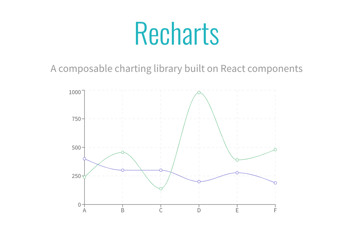
Recharts offers beautiful charts right out of the box, and you can modify them by adjusting component props and putting in your own components. The given reusable components can also be modified by the user to better suit their own purposes. Unfortunately, the library's charts are not designed to work well on mobile devices. Putting them inside a responsive wrapper component will fix this issue by automatically adjusting their width to match the width of the viewing device.
React-chartjs-2
If you know about the charting library chartjs, you know that React-chartjs-2 is not a typical React graph library. It's better to think of it as a React wrapper for chartjs, which is a JavaScript library for making charts.
For those who don't know, chartjs is a React chart library that is easy for beginners to use. It uses HTML5 Canvas to build chart components that are different from each other in their types and kinds. To use React-chartjs-2, you should know how Chartjs works and how to read its documentation. Since the framework is easy to understand, it shouldn't be too hard to do the same.
D3.js
D3.js is a JavaScript library that lets you use data to change documents. D3 lets you use HTML, SVG, and CSS to bring data to life. By focusing on web standards, the D3 Reactjs graph library lets you use all of the features of modern browsers without being tied to a proprietary framework. It does this by combining powerful visualization components with a data-driven way of manipulating the DOM.
Chart.js
Flexible and simple, Chart.js is a JavaScript charting library that delivers cool features for the modern web such as colors plugin, tree-shaking, scale stacking, subtitle plugin, line segment styling, advanced animations, and more.
Victory
Victory is a popular React chart library that can be used with both React and React Native. It has a set of charting components and the same API for all applications. Users can make charts out of data for both Android and iOS apps using the same API. The library makes it easy to make charts that work on different platforms. It is also easy to learn and use.
It also makes it easy to add charts like line, pie, bar, and candlestick charts to web and React Native apps.
Nivo
Nivo gives web developers a unique way to make charts and other data on the server side. For data visualization and presentations, there are many different and creative templates from which to choose. The chart library has unique and eye-catching ways to show important information. Nivo is a charting library that gives you SVG, HTML, and Canvas charts, as well as transitions (or motions). Nivo is a one-stop shop for you if you are looking for a precise and flexible way to visualize your data.
React-Vis
React Vis is one of the best React charting libraries. It was made by the web developers at Uber Open Source. It gives you a pretty easy and quick way to figure out how to chart the parts you need for your data visualization needs.
Some of the most common charts for visualizing data are line charts, area charts, bar charts, pie charts, donut charts, contour plots, heat maps, hexagon heatmaps, scatterplots, pie and donut charts, sunbursts, radar charts, parallel coordinates, and treemaps, to name a few.
VISX
VISX is a new name in the field of React Chart Libraries. It was made by Airbnb and has an active repository that combines the best parts of React DOM and D3.js in a well-thought-out way.
This library uses the power of both D3.js and React. D3.js is used to do complicated calculations behind the scenes, and React is used to update the DOM. It is broken up into several small packages. This keeps it from getting too big because developers can only download the packages they need. It is also neutral because it lets developers use their own libraries for animation and state management. Since VISX assumes you're using React, you can choose any animation library that works with React.
VISX is easy to use for developers who know React, and the developer can make changes as needed by making their own chart components that can be reused. You can build complex visualizations by using small D3-based primitive visualization components. It comes with well-organized documentation and a gallery of examples to make it easy for you to get started.
BizCharts
Everyone knows about the tech giant Alibaba who are the ones behind BizCharts. BizCharts is a React Chart Library with an impressive library and plenty of different uses. BizCharts is also known for having the largest collection of charts so far. This makes it a great place to start when designing and visualizing data.
React-stock charts
The React-stockcharts library is a must-have React chart library for anyone who wants to see their stock chart data in a variety of styles that are both flexible and easy to understand. React stock charts are a one-stop shop for web developers who want a framework for displaying financial data.
You can track and show the stock price of any company over a certain time period using charting and range tools. The component has zoom, pan, tooltips, crosshairs, trackballs, period selectors, range selectors, and events to make stock charts more interactive.
Rumble Charts
Rumble charts are the best React chart library to use if you want to make anonymous charts with React. It's a simple app with templates from today. Rumble Charts can be thought of as a way to use react components to build flexible charts that are easy to put together.
React time series charts
For time series components, the React time series charts are a React chart library that is always available and gives out a well-organized set of charting features that are chosen to fit the needs of modules. These charting parts make it easier to see network traffic and time-series data in a logical way.
Ant Design Charts
Ant Design Charts is the next best charting library for React. It is much easier for students of the React technology stack to use. It gives you high-quality charts right out of the box and asks you to look into how the default charts affect the user experience. Users can easily change the details of charts to meet the needs of their business. This is in part because the documentation is so good and has so many examples, rules, and variations. It's also a great platform for making changes to existing themes and components.
Ant Design is used by companies such as Lenovo and Toyota. It's a great choice for business projects at a high level. It's a great choice for beginners because it has so many resources.
eCharts for React
ECharts is a powerful, easy-to-use, interactive charting and visualizing tool that works well for business presentations. ECharts is a robust open-source charting library that makes it easy for developers to incorporate interactive, customizable, and responsive charts into their React websites. With this charting library, developers need only describe the chart's settings in an object and send that object to the ReactEcharts component's prop in order to get started. The lack of walkthroughs in the documentation can make it difficult for newcomers to understand and use, and some developers may feel that the documentation is inadequate.
React-financial-charts
React-financial charts are dedicated to finance. With many improvements throughout the years, this viable option delivers options to present financial data where users can customize thickness, brushes, and outlines of Stock Charts for composite series.
React-timeseries-charts
React time series charts give you a React chart library with time series components. This gives you a set of well-organized charting features that meet the needs of modules.
React time series charts help you see network traffic and other data that changes over time in an organized way. They add clear examples and clear documentation to the platform, which makes the low maintenance worth it.
This library was made for React so that network traffic and time series data can be seen. The library for React is mostly about time series data charts. They were made with d3 and React at a higher level of being able to be put together. Even though the library isn't actively updated or maintained, it can be used for a lot of examples and documentation.
Storytelling using React Graphing Libraries
As humans are presented with an ever-increasing data flood, visual storytelling is more crucial than ever. Visual, interactive metaphors are more successful in engaging human perceptual processes than static number figures and text. Incorporating visuals into information has been shown to greatly enhance engagement.
Information can be communicated more quickly using visual aids than through a lengthy spreadsheet or lengthy report. Metaphors in visual form serve as a bridge between speakers of different languages. Using data visualization charts makes data more digestible, which in turn aids in the rapid extraction of insights, the enhancement of decision-making, the exposure of previously hidden patterns and relationships, the anticipation of emerging trends, the facilitation of visual analytics, and the enhancement of collaboration.
Svitla Systems has rich experience and expertise in web solutions development, including React as well as in building high-end data visualization on React. If you care to learn more, please contact our representatives for more information.