

What is Contextual Help and Documentation?
Contextual Help is an action given to provide assistance. It is integrated inside a product without the need to read the full documentation. Contextual Help can be seen in tooltips, pop-ups, dialogs, and side panels. It is great for guiding users on what a specific feature does or what a field means.
Documentation is an extensive, descriptive text provided to users when they seek a piece of advice or want to learn about specific parts of the product or service. It is usually made available via help center pages or support pages.
Help and documentation are ranked 10th in the list of 10 usability heuristics. It is not only an indicator of good design but for some users, having the means to ask for help and quickly find said help can be crucial.
Who are the main users?
New users
First-time, new users who are not familiar with an interface and need assistance. For this purpose, one of the best ways to assist users is to provide onboarding tutorials.
New and experienced users
Onboarding is also a good way to update users when the product was redesigned or some features or options were updated.
Users who need to recall
Users who quickly want to look up a particular fact about the product or when they cannot remember it at the present moment.
Users who need recover
Users who want to find out what went wrong when there is an issue or a problem.
Users who need assistance
Users who cannot complete specific actions or tasks.
Users who want to become experts
Users who want to gain proficiency in the product.
Contextual help in tooltips
A tooltip is a small rectangular overlay that provides brief information related to the content. Tooltips are triggered when users hover their cursor over a link, an icon, or an image. Tooltips can be text-based or graphic-based. The Lucidchart intelligent diagramming tool has both types of tooltips.
Lucidchart. Text tooltip.
Lucidchart. Graphic tooltip.
Benefits
- Easily triggered
Drawbacks
- Distracting (especially for those users who are familiar with the product)
Contextual help in pop-ups and dialogs
Contextual help in pop-ups presented as short, informative text. It can include graphics and tutorials.
Figma provides a good example of an onboarding tutorial in a pop-up dialog. Users can interact with the content by switching tutorials or navigating to an external page by clicking More.
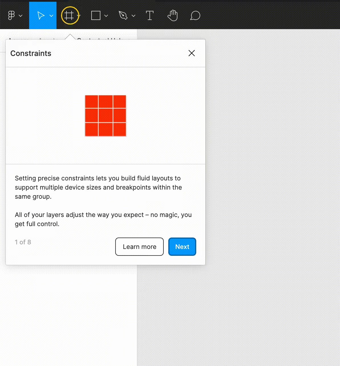
Figma. Tutorial pop-up.
Adobe offers a tutorial in the dialog that pops up right after logging in. It’s a quick and easy way to suggest other options to users.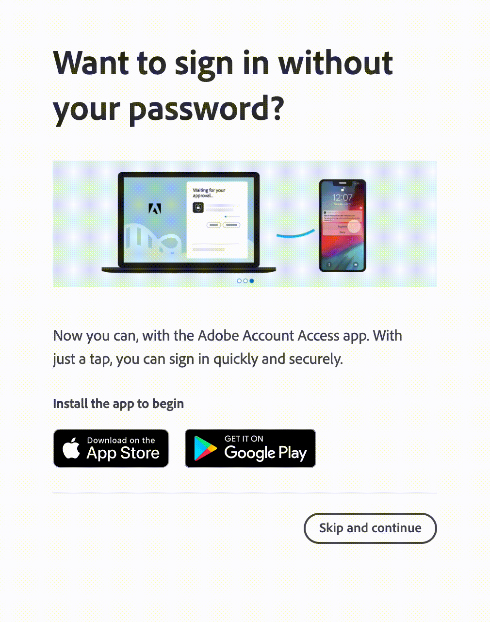
Adobe. Tips demonstration in a dialog.
Pop-up dialogs can be more complex, especially when you need to put more information in one place. Information in them is split into chunks and corresponding lists. It can be revealed when a specific icon or button is pressed. Gmail displays quick start guides and help in a dialog box. It provides access to the help forum and all related articles. A nice bonus is that the dialog can be dragged to help reduce content overlapping.
Although I enjoy using Figma and it's my primary design tool, I think links inside a pop-up could be designed more clearly. After clicking on one of the links, most of them unexpectedly would take you to an external source.
Gmail, in comparison, clearly indicates which link would open an external page and what information will be revealed in the dialog. 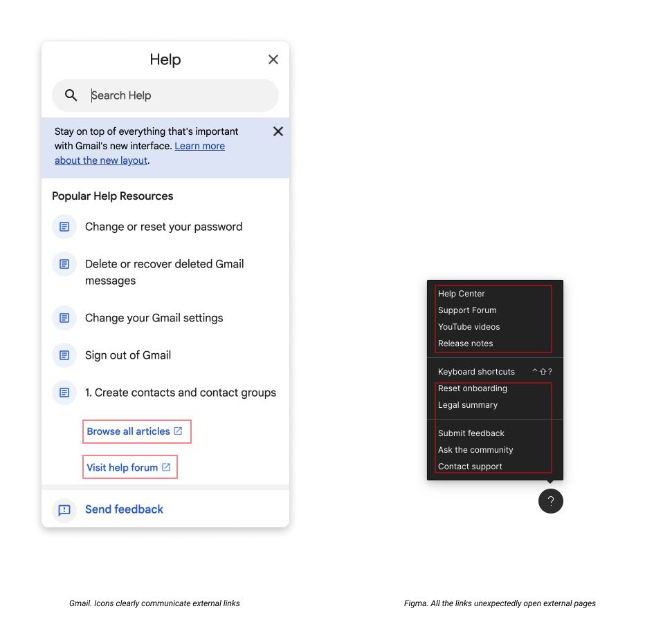
To give credit, Figma offers fantastic documentation about keyboard shortcuts. It is integrated into the tool and opens up like a console panel.
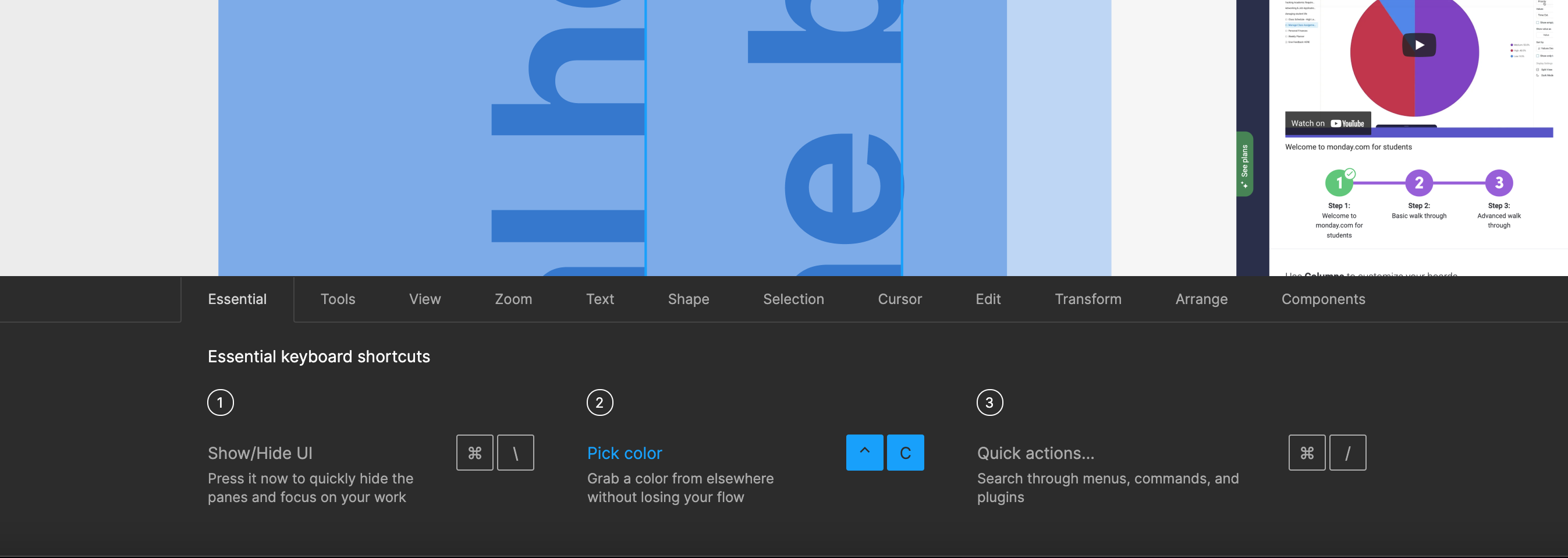
Figma. Keyboard shortcuts.
Benefits
- High visibility
- Reachable within one click
Drawbacks
- Overlaps the content
- Blocks user actions until dismissed
Contextual help in side panels
Contextual help in side panels can contain more information because of its size. They include video tutorials and training modules, graphics, information on featured options, search, and links to help pages. But it comes with its benefits and drawbacks. For example, on the Monday tool, the Help section takes up a large portion of the screen and the content. For some users, it can be distracting and overwhelming.
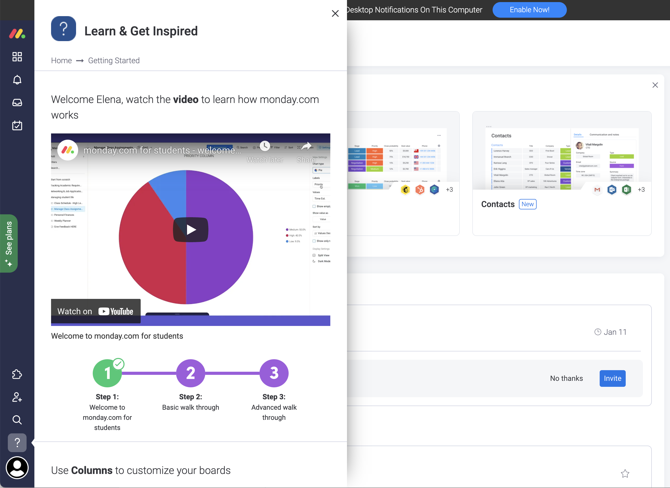
Monday. Help integrated into a side panel.
Outlook also provides a good example. Help is integrated into a side panel that moves the content to the left. The content adjusts to the new width, and all the information stays in focus.
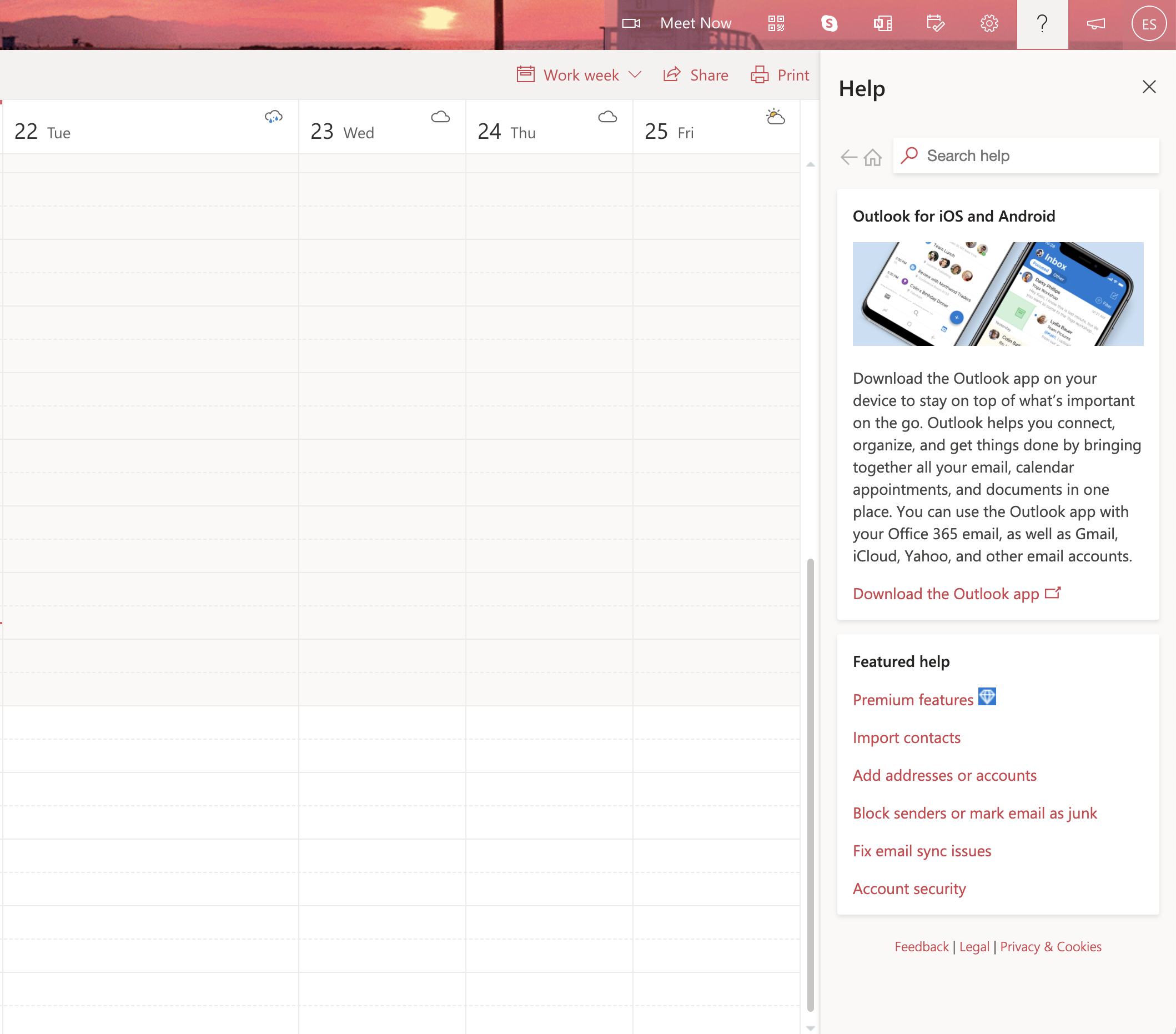
Outlook. Help in a side panel.
Benefits
- Well structured
- Include more detailed information
Drawbacks
- Can be too heavy and overwhelming
- Can block visibility
Help pages and documentation
Help pages contain more detailed information and cover many topics. Technical documentation, feedback section, FAQ, and support are all parts of Help pages. The information is divided into categories.
Help pages consist of related elements grouped together and that display a visual hierarchy. Good Help is easy to find without distraction. And good documentation is written in simple and concise language to provide quick search results.
Material Design is a great example of technical documentation. It is comprehensive and detailed. The information is divided into blocks, the text is descriptive, and it contains graphic elements.
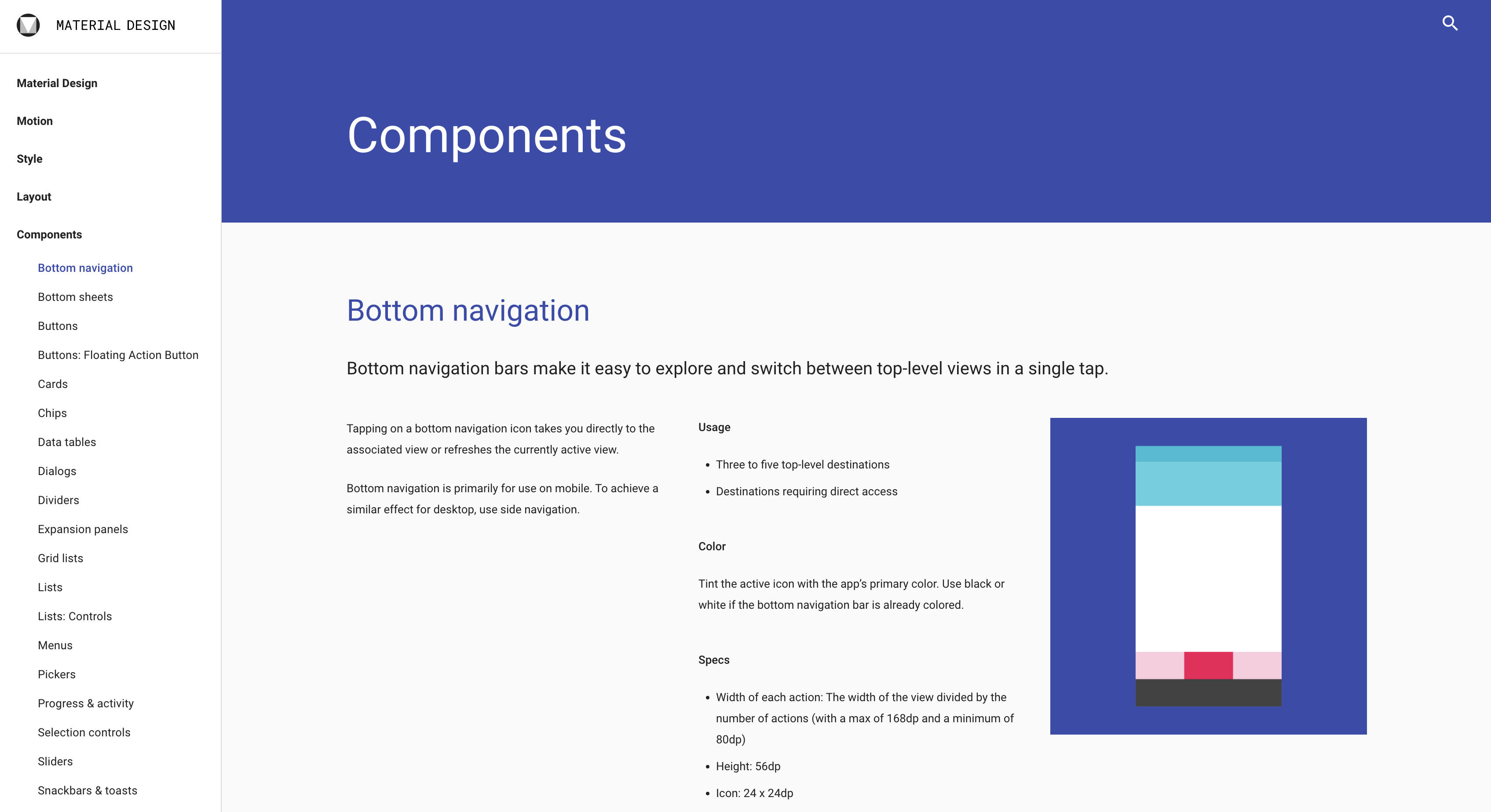
Material Design guidelines.
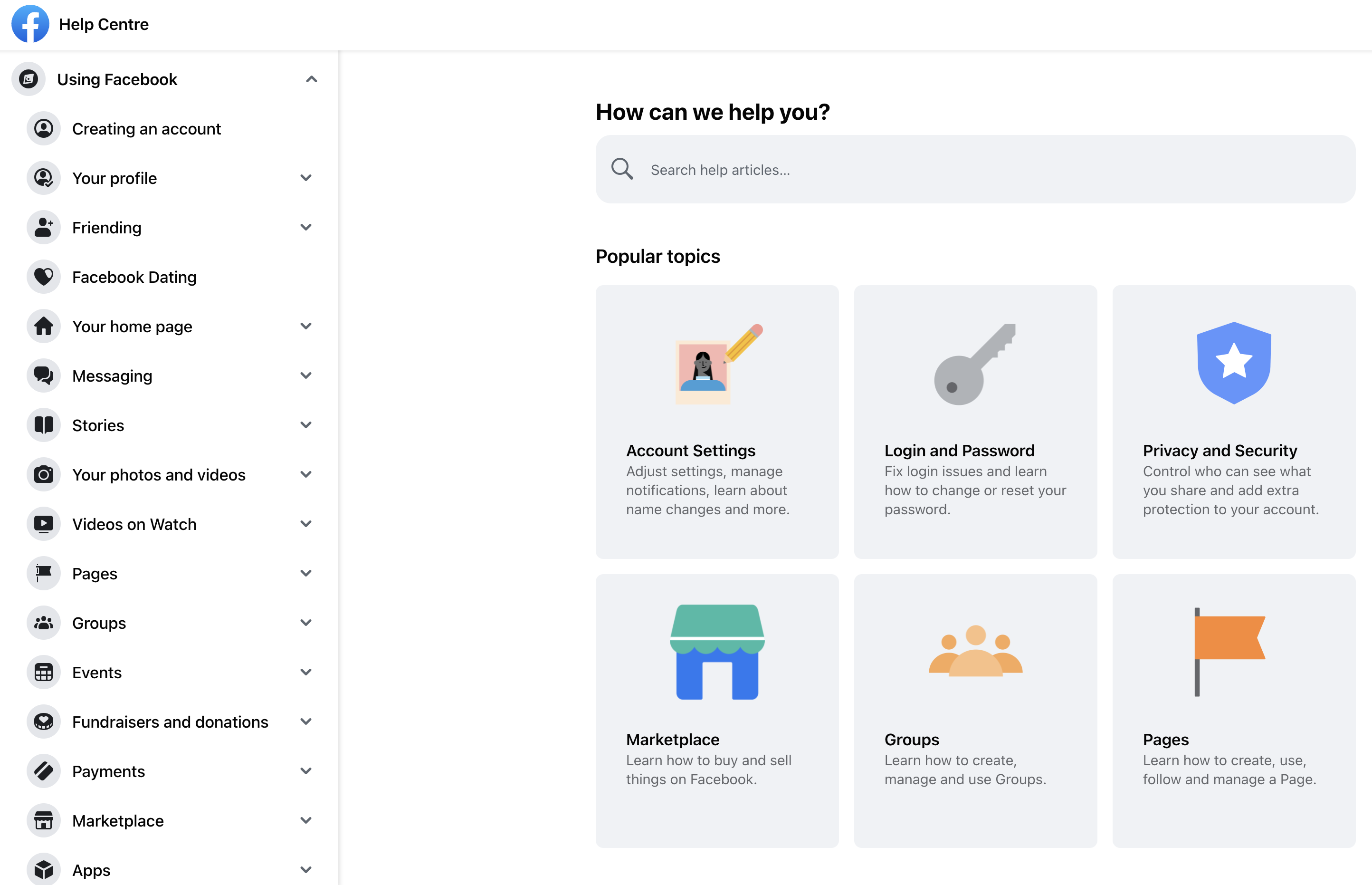
Another positive example is the Facebook Help Center. It is easy to navigate and all the information is stored in one place.
In comparison, the Google Help Center is too cluttered with information, categories, and filled with link buttons that take you to other parts of the documentation. It's easy to lose focus and get overwhelmed with information.
Benefits
- Well structured
- Include detailed information
Drawbacks
- Time-consuming. It’s easy to lose track of time
- Can distract from the main purpose
- Can be too loaded with information
Summary
Users may be reluctant to refer to documentation for various reasons:
- documentation may be boring and difficult to understand;
- it is time-consuming;
- users may feel lazy and prefer alternatives.
Yet, it’s still important to provide users with help and documentation when they need it.
To create good contextual help, information should be divided into categories, showing a clear visual hierarchy, and highlighting keywords. Help should contain search capabilities and be complemented by graphics and videos. It should be written in plain language, troubleshoot, and help users recover.
In case you need help, advice, or consultation on building and providing Contextual Help, our specialists will be happy to help you.