

The idea of creating a spreadsheet came from Harvard University in early 1979. Daniel Bricklin, an engineer, and his friend Robert Frankston, a programmer, were performing economic calculations using a ledger. Together, they developed the first spreadsheet program. It allowed users to change any cell and have the entire sheet automatically recalculated. With this software, 20 hours of work could fit into a 15-minute time frame.
Let’s look at creating a Figma table step by step. In this blog, we will consider making tables in Figma based on CSS.
Table of contents:
- Anatomy of data tables.
- Building data tables in Figma based on CSS.
- Padding.
- Alignment.
- Borders and dividers.
- States.
- Approaches for responsive tables.
- Customization of data table cells.
- Update and change elements in data table components.
- Conclusion.
Anatomy of data tables
The anatomy of data tables is pretty simple. Rows and columns make it easier to scan through a file, and each can be divided into data cells. Rows have the same number of cells in order of the corresponding columns. The most prominent examples of data tables are, of course, Microsoft Excel and Google Sheets. Data tables can be split into three main and three additional parts:
The main parts
- The header row contains titles for columns;
- The data row combines ordered data cells that compose a data object;
- The data cell is the smallest component of the table that shows actual data.
The additional parts
- The footer is commonly used for summarizing, summing up and aggregating information in the corresponding column;
- Pagination can be divided into page;
- Data tables can contain interactive components like buttons, menus, icons, etc., and non-interactive elements like badges or tags; other tools that help manipulate data include filters, the sorting feature, etc.
Building data tables in Figma based on CSS
If you are a developer, you integrate the design of data tables with HTML and CSS. If you are a designer who works in Figma, you do the same by using CSS attributes. Let’s go over the main attributes and talk about the structure that helps a user scan information in a table.
Figma tables are very convenient to describe using CSS. In this way, it is possible to apply the existing arsenal of knowledge of developers and, on the other hand, to unify the approach to creating tables. This dramatically improves the subsequent work of HTML/CSS layout for pages where tables will be used. It also makes it easier to work with interactive components in tables.
Padding
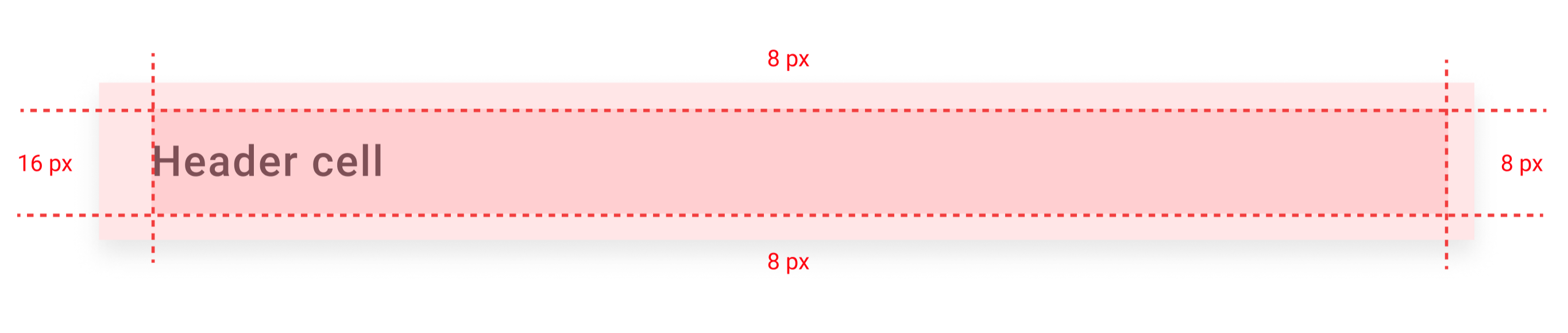
Cell padding is needed to control space between the border and the content in a cell; I work using an 8-pixel grid, that’s why I will set padding-left to 16px, and all the others to 8px.
Alignment
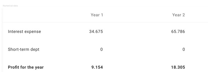
If you do the UI for the right-to-left (RTL) language scripts, you will have to mirror your layout and use RTL direction; other than that, use left-to-right (LTR) text alignment. Headers should be aligned in the same direction as the content in the corresponding column. If the numbers are going to be added, align numbers in numerical data to the right. Icons and badges should be centered.
Borders and dividers
The border is another property that stands for the horizontal divider. It splits each table row in a data table. Although borders can be very useful for dividing data, they are not mandatory. White space is often used instead of borders to avoid an overwhelming design. It all depends on the data saturation in the data table.
States
The hover, focused, and active states change the background and/or an icon color when the cursor hovers and/or clicks and/or selects the element/cell/row/column area. These can be easily set by adding a couple of states in Variants in Figma to highlight the parts of the data table.
Approaches for responsive tables
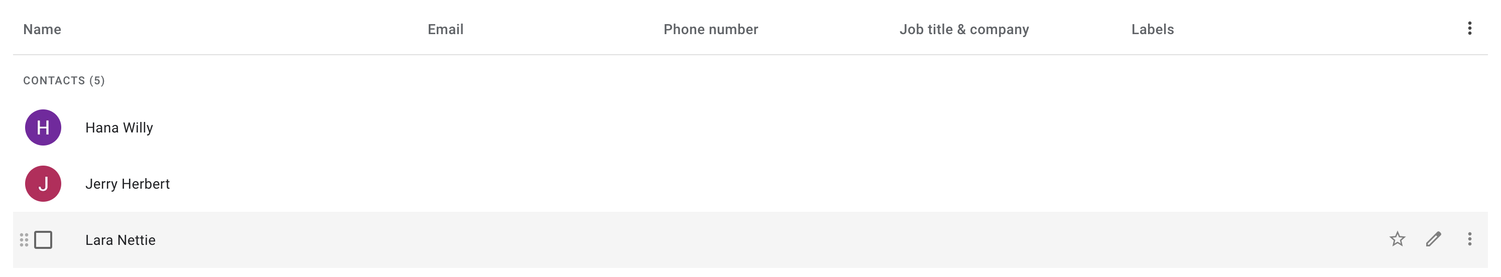
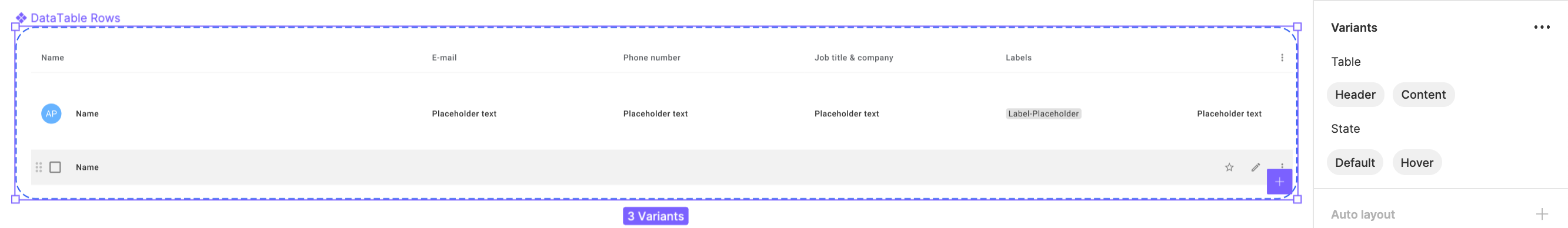
Let’s look at how to create a table in Figma with a responsive design. This is an effective option for different screen sizes in browsers. A table behaves responsively if the columns squash horizontally. This is commonly used if the cells have little content. If the content and the exact columns’ width are critical, the solution will be to use a horizontal scroll. For small screens, the number of rows and columns should be reduced and collapsed. I'm going to take the browser version of the Google Contacts table ("comfortable view") and replicate it in Figma. The columns will be squashed and responsive. Also, I am going to add a default and a hover state, add a possibility of adding more columns, and change screen sizes on the fly. To change the content, I will create as many variants as needed.
Customization of data table cells
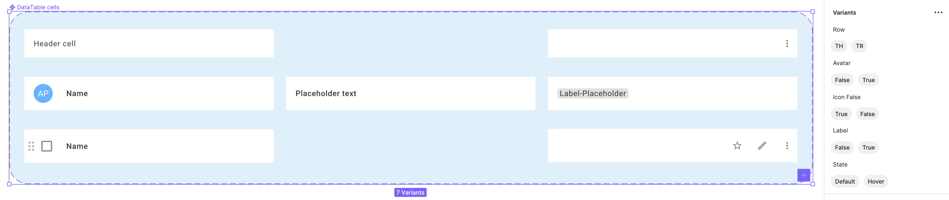
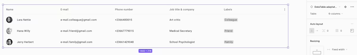
In the example, the table has six columns. The number of rows can be as many as you want. The hover state reflects with more icons and replaces an avatar by a checkbox and a drag icon.
I will need to create:
- One header row cell component with sufficient text that will be linked to the column’s content;
- One header row cell component with an icon (the 6th column);
- One table cell with an avatar placeholder and the name;
- One table cell with sufficient text that responds to the column title;
- One table cell with a label:
- One default state for the row;
- One hover state for the row.
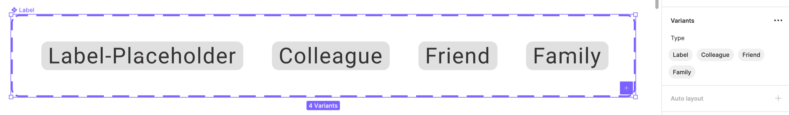
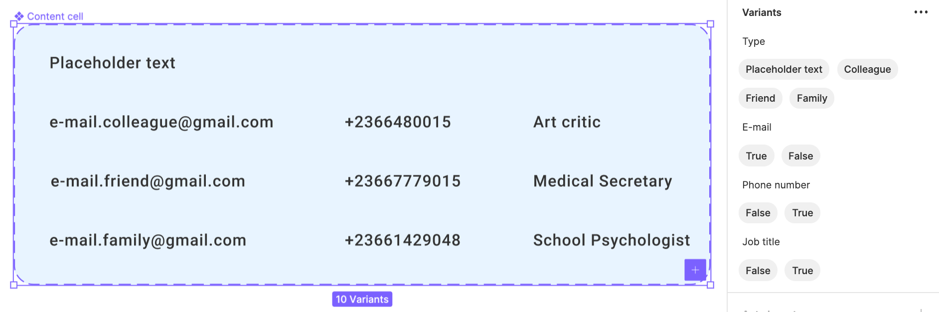
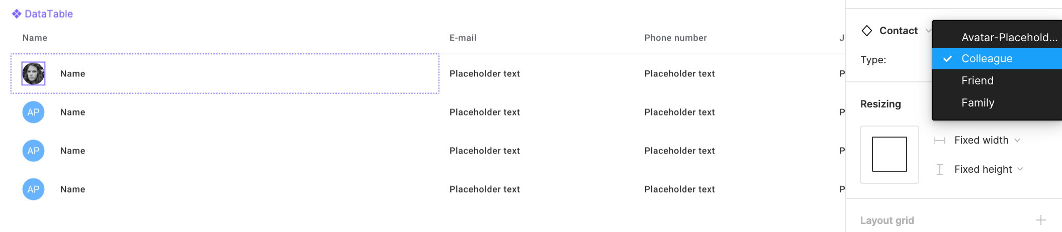
In order to change and update elements in the components, I am going to create a small library in the local file. For avatars, I will create variants with different photos. For the labels there will be: friend, colleague, and family variants.
Contact.png)
The content that contains different email addresses, phone numbers etc., can be added as variants too. This will save you a lot of time later.
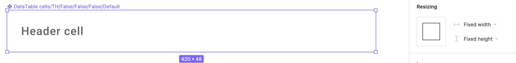
First, create a Header cell and frame it. Then, apply Auto layout to it with the properties set to fixed: the width to 420 px and the height to 48px. The title should be centered and the left padding set to 16 px. If you want to separate a header row, you might want to use Effects. I applied inner shadow with the properties: 0px by X coordinate and -1px by Y, no blur, 5% of Black color. It gives a nice divider.
Next, let’s duplicate the existing component, detach it and create a new one with the “dots-vertical” icon. It should be aligned to the right. The padding should be set to 8 px.
Header%20cell%20.png)
Now, let’s move on and add 2 more components! I'm going to build a cell with an avatar, a label, and a content cell that was created as a variant earlier. The fastest way is to copy the main component, detach it, and update it with the actual data. Then create a new component! The properties should be set to the width 420 px and the height 56 px. The last component will be the exact copy of the first one, with the only difference being the font color; in this case, it will be darker. For the hover state, the icons will replace the text. I recommend using the Iconify plugin. Most of the Material design icons are placed there. Also, you can find a bunch of other icons that suit your taste.
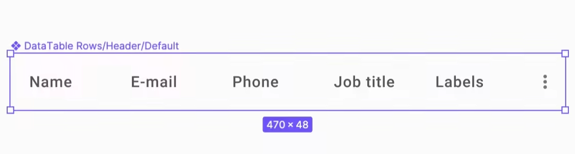
All that is left now is to group the cells into rows. I'm going to take the cells and build a new component, then name it Header. Don’t forget to check the resizing settings for the cells. Set the cells to Fill container to make the row fully responsive.
In the example, you might have noticed that the first column has the biggest width and the last one the smallest one. To achieve that effect, I set the 1st column width to 624px size - fixed. I used Hug contents for the last column to wrap up the icon container. I also added a default and a hover state.
Update and change elements in data table components
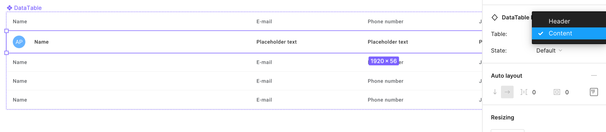
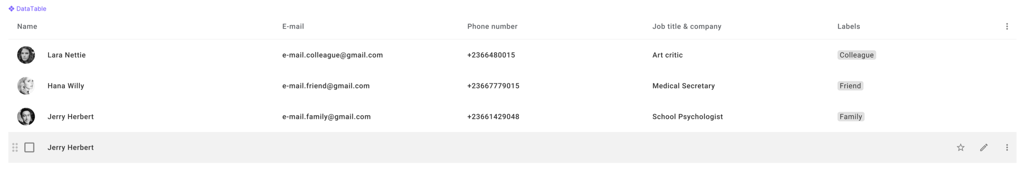
To change the content, I will use the local library of components I created earlier. First, I will choose between Header and Content. Then, I will update the avatar, email address, a phone number, job title, and a label associated with the specific person. In the next images, we show several examples of Figma table components.
I will set all the row components to Fill container to achieve the adaptive effect. The main data table component width should be set to fixed. As a result, you should get something like this.
Now, what if I want a data table to be flexible within columns? For example, I want to use 6 columns and switch to 4 or 3 in some cases. To do so, I'm going to create 3 more variants using a data table component as a base.
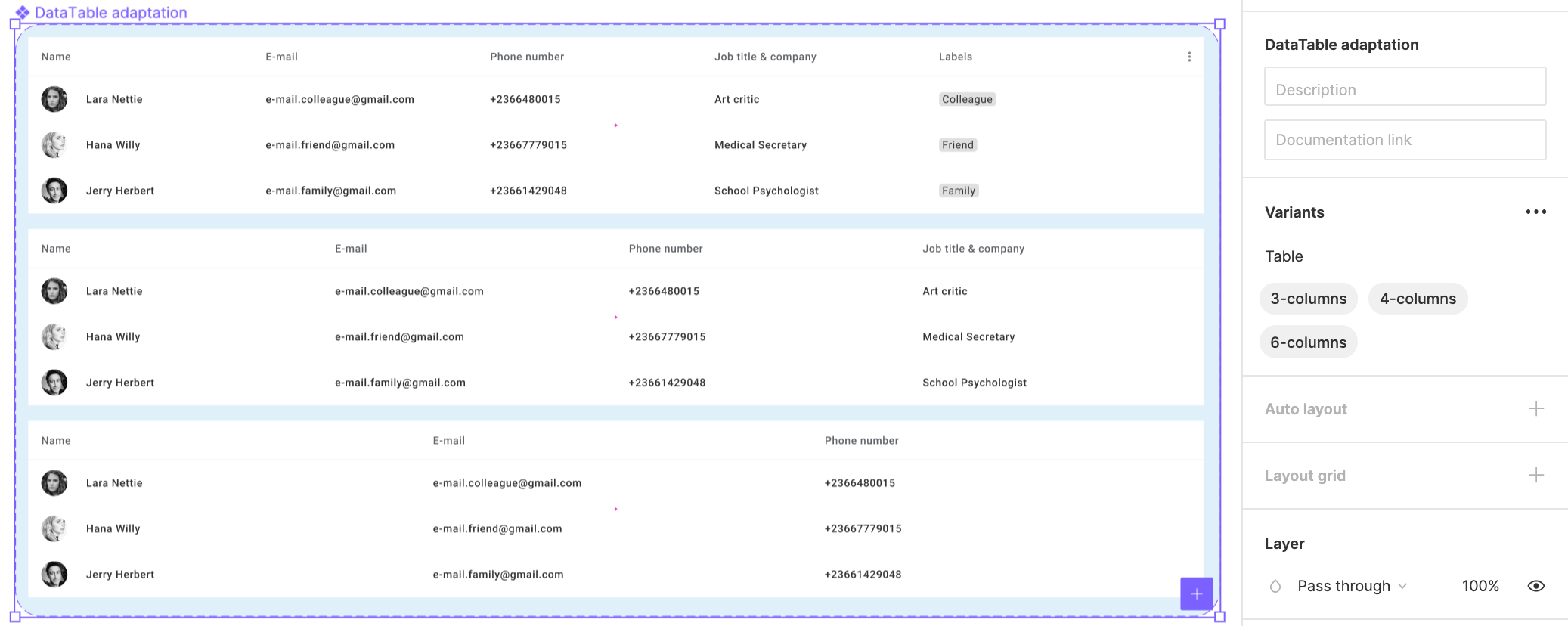
Now, let’s see how it works.
Please note that you may create a table in Figma with the Table Creator Starter Kit. It is a very handy instrument that helps with different kinds of tables.
Conclusion
As of today, data tables remain one of the best options to show massive amounts of data. For this reason, data tables can turn into cluttered and barely understandable bulk of information. Grids and horizontal lines, zebra stripes, font and background contrasts, appropriate padding and column alignment can help with solving issues on bad readability, improve perception and move designs to the next level. If you are interested in creating designs with Auto Layout and Variants in Figma, check our previous article. Svitla Systems’ experienced designers and UX/UI developers have a superior level of understanding and practical expertise in creating large projects with tools like Figma. If you need to develop your project from scratch or rebuild an existing project, please contact Svitla Systems representatives in your area.